Hello


Welcome to 1st vertical a personal
blog about design and other stuff !

Friday, 21 October 2011

Life Studies in Marker and conte

The following life drawings show a set of studies done 
over a period of an hour.
I used a dry wipe marker pen on brown parcel paper 
and then used a white conte chalk to create the strong 
one point lighting.
I prefer drawing on  parcel paper ( dull side ) as its takes 
materials such as characoal and markers so well. 
The mid tone brown has a warm contrats to the bleach 
starkness of White cartridge.
The nap of the paper allows for great chalk and pastel overlay. 

Tuesday, 13 September 2011

Starting Points


(Click image to see larger in browser )
The Starting point for all drawings is critical and for me never arbitrary

For instance I always start with one eye and look for where the “lines” of the Pupil pass behind an eyelid. In the example from my self-portrait (previous post) you can see  4 crossing points .
These are my “anchor points “ Everything else must now relate back to these. (image left )
The orange lines represent what my eye is doing when looking at something in terms of the
“measurement and relationships” between horizontals, verticals and curves etc .
From the image on the right its easy to see that the bottom of the glasses lens is far greater than that of the distance from top Eyelid to Glasses rim above. So I draw it like that …It’s what is there …..it’s what I see ...
Don’t Think and Guess….look , look again (maybe look again) until you see and draw it as you see it.
That,s it ...
nothing special ....no magic trick...its NOT a gift ...we can ALL draw   


Monday, 12 September 2011

Self Portrait


Self Portrait in Blue Pencil Crayon. 3 hours observational drawing.

Incoming students have to do 7 versions showing different expressions so I feel it's important to demonstrate how I approach drawing facial characteristics.


Friday, 9 September 2011

Wednesday, 31 August 2011

Sketchbook Archive


Top image
Gourds in Cafe in Phaphos Cyprus
Ball point pen on Nepalese Paper 

lower image 
Phaphos Bay 

Monday, 22 August 2011

The "Spork" in WallE and our Image Symbol System

I bought some fruit in a plastic container which had a plastic fork in it. 
Actually it wasn't just a fork it happened also to be partly a spoon. 
Therefore I gave it the name "Spork".


In WallE by Pixar there is a wonderful part where he collects odds and ends whilst on cleaning duty outside his container home. One item is a "Spork. 


On return he wants to put it in one of two containers which hold forks or spoons. WallE however cannot decide which one to put it in, as it is neither one nor the other , and so places it slightly frustrated in between. 
Now this was beautifully observed by the director of this animation and shows something very significant about our own image / shape recognition.

What I want to do is how this relates to the way we see and how this affects how we draw.

 A fork is an everyday utensil that we can recognise easily through common usage. However without an understanding of what it is it would be merely regarded as a  piece of metal, plastic or wood fashioned into a particular shape. Someone who has never seen or used a fork would not have a label for it or see any reason to use it in a particular way.

Observational Drawings (Drawing things from life ) as we see them requires a form of dissengagement from this "labelling mind" in order to "really" see what is "actually" in front of us...


Now I have been reading Betty Edwards book carefully this week and she appears to have encountered the presumption from students  that merely "looking at something" with your eyes you actually "see it"

Actually what is really happening is your mind tends to  image  / shape /  form / Label ...and once recognition takes place there is no further need to "look" However "seeing" is a completely different matter ...going beyond the taking it for granted phase.


Take "The Mona Lisa" by Leonardo Da Vinci as an example of something you think you have seen. Think about the painting for a minute.


OK which hand rests on which?


Yes you can guess but can you clearly visualise it ...?


I got it wrong and I have studied art for 25 years.


I guess you were expecting a question about the smile ....


So what does that have to do with a "Spork"? 
Well its about seeing things closely as they are, without placing importance in a specific part. If you want to draw accurately rather than "realistically" then"turning off" this automatic response mechanism which wants to immediately label and categorise is the way "to see"


This is NOT easy to do . However the method of seeing that I want to follow up with should in time start to delay and ultimately reduce this natural tendency transforming your visual sense into a way of seeing  things incredibly clearly. 

Akt


Digitally enhanced life drawing using Painter clone tools 
to add depth and tone. 
Seeing the figure in context to its surrounding is equally 
important even if only as subtle suggested marks.

Tuesday, 5 July 2011

The Pleasure Principle

Went to see the Rene Magritte expo at Tate Liverpool last Saturday.
Thanks for getting me in as a guest Deena ....

What struck me about this exhibition is the breadth of Magrittes work.
Despite the copies and parody of his work in advertising etc I have always liked Magritte.
Exhibitions of this kind open up new insights into the artist you tend to only see in reproduction print or online.
Seeing paintings for "real" shifts our assumptions sometimes and more often when the planning and sketchbook work sits side by side the end result.
Of course all the famous / recognisable works are there in the main,  but also letters and notes showing how his ideas developed.
What was also good is that an ex student of mine bumped into me ....he had travelled over from the Wirral side of the Mersey and was inspired to come and see a favourite artist of his own...

A good  day

http://www.tate.org.uk/liverpool/exhibitions/renemagritte/default.shtm

Friday, 24 June 2011

Tonal studies in Charcoal

Both of these drawings started with a  basic charcoal dusting 
This gives a "ground" to draw in darker areas whilst removing it with 
erasers to get back to a lighter tonal value 
 Inspiration came from Jim Dines drawings 


Wednesday, 22 June 2011

Sketchbook


Sketchbook Ink drawing
Cheadle Staffordshire

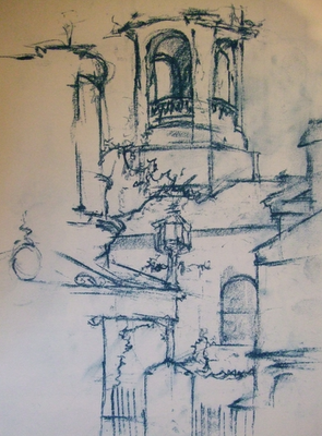
Measured line

Both of these drawings use the same approach despite one being a view of buildings and the the other a life study.
In both I have utilised a basic starting point and worked outwards from the centre. 
I use the relationship between lines / shapes / negative space  to measure where the next one will be. I make new marks very close to the previous one so that the measurements are easily seen. Usually I draw 4 lines close to one another to form an "anchor" in the composition.

I started this drawing of the Square in Cazorla, Spain where the small window is directly above the top of the lamp post. This allowed me to create many realtionships between the walls on adjacent buildings.


Thursday, 16 June 2011

Relaxed Portrait

Hello

In the next posts I hope to pass on the method of drawing / seeing that I learned from a great teacher at Manchester Polytechnic way back in the 80's and have never looked back. 

Also if you want a great book to read then Betty Edwards "Drawing on the Right Side of the Brain" is a classic. 

Oh and this is a Manga free Zone !!

T